Saturday, 17 March 2012

How to design a luxury packaging

- How to design a luxury packaging ? 
- How to choose appropriate signifiers in luxury packaging ? 


As we known, high class product need a luxury packaging to fit with its price. 


The choice of colour and imagery are the most important signifier for luxury packaging. Therefore, before we start to design luxury packaging, we need to collect visual reference, and  analyse them.


In this stage, we can more understand what colour and imagery will be related to luxury.


After analysing luxury packaging, I have summed up some luxury signifier to apply in designing luxury packaging.

Luxury signifiers (take colour and imagery as example)

- Colour
At first, the choice of colour is quite important, because colour can communicate specific meaning. For luxury, we have to choose some colour which can convey high class and value messages effectively.

These colour, black, golden, silver, white, can symbolise classic and high quality.

Take mooncake packaging as an example, the left packaging is more luxury than the other one because of the choice of golden colour.


- Imagery
Curve and streamline patterns can communicate sophisticated and luxurious.


Colour will be the first impression for consumer to decide the product position, for example, if the product belong with luxury category, colour will be more like to choose black, white, and golden.

Another important element in terms of packaging design is imagery, an appropriate imagery enhances consumer interest and makes a strong visual impression. Images can create visual excitement and become what the consumer visually identifies with the product. ( Marianne & Sandra , 2006)

In order to communicate with consumer the product messages, designers have to be familiar with the choice of signifiers.

Saturday, 11 February 2012

Redesign a luxury packaging

Redesign a luxury packaging : Waitrose’s British Garden Peas


Garden Peas is a common product, which can be easily found in supermarket. However, the price is mostly depended on different levels of supermarket, so there’s some problem surfaced the current packaging of peas: the packaging of Waitrose’s peas seems not luxury enough to match the price. 


Brand Value: Waitrose has the greatest extension capability with 80%, even though it has the smallest market share of the major supermarkets. Besides, Waitrose brand is well positioned in providing a wide range of high-quality and own brand products.


The challenge is to design a luxury packaging of peas, which can be fit in with its price. Considering different elements, which can represent luxury.

I design different visual concepts of peas which are based on luxury. 


At first, I try to create  a repeat luxury pattern as background,although black represent luxury, the surface design did not look like peas packaging. Then I design a transparent window to show peas inside, which can let consumer be more confident about what they bought.


Streamline or curve is one way to show luxury, therefore, I design a streamline pattern with transparent window, also select appropriate colour, black and golden, to make the peas packaging be more luxury.


Also I designed a presentation board for British garden peas:


Thursday, 9 February 2012

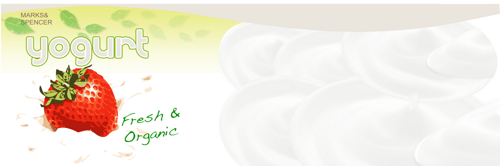
Redesign a fresh and organic yogurt Packaging:MARKS & SPENCER


Original

Re-Design
The target market of MARKS & SPENCER is middle to high class customer. Its product are high quality but medium price. The challenge is to redesign a yogurt packaging for MARKS & SPENCER, the packaging should communicate its product concept and meet the price.


Final Design


Coffee Cup Packaging : 7-11 CITY CAFE

Halloween


Design Concept-
On Halloween, children put on ghost and fairy costumes, ring neighborhood doorbells and utter the traditional challenge: “Trick-or-treat?”
Therefore, I used trick-or-treat as the inspiration for my design concepts. On the scary eve of Halloween, everyone can knock on the great front door of City Café and demand a cup of delight.


Valentine's Day


Design Concept-
City Café positions itself across the whole city as one’s personal coffee shop. Hence I strove to use this design concept as my departure point. When designing the body of the cup, I inputted elements evocative of the city such as a multitude of neighboring buildings and individual “small budding branches of love” which grow above the city. This communicates the notion that the city is rendered warmer and pleasanter by the existence of City Café.